COLOUR
COLOUR
Now that you are armed with how the exposure trio works, we can start thinking about what you point your camera at and why. A good introduction to colour photography is through the colour wheel with its various colour palettes that can open up a whole new world, acting as a guide to whatever situation you find yourself in. Some of these are;
1. COMPLIMENTARY COLOURS - opposite each other 2. ADJACENT COLOURS - Neighbours 3. COLOURS IN HARMONY - non contrasting colours. 4. MUTED COLOURS - all the above, but less intense. MONOCHROMATIC COLOUR - a single colour and its shades.
But as colour does tend to be an emotional response about which colours work - it is therefore quite a personal preference. But it is a good idea to have some knowledge about which colours to use, and the following groupings will help you to have some control over your imagery. So digest them, let them sit awhile and when you next go out to shoot, they may bubble to the surface. So lets have a look at colour in a bit more depth.
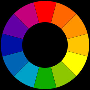
The colour wheel
Colour- Complimentary or opposite
These are colours that are more or less opposite each other on the colour wheel. When two opposites are seen together in a composition, the colours appear more intense than if they were by themselves, hence they ‘compliment’ each other. This is very apparent at dawn, dusk or twilight where the blue sky is complimented by the warm colours of artifical lights, or any situation where two opposite colours interact, like red flowers with green leaves.
Because of this complimentary dynamic, it is quite graphic and tends to grab your attention, ideal whenever you want your reader or audience to sit up and take notice. It has the affect of ‘Stop, look at me NOW!’ Of course there may be other colours added to the mix of your composition, in fact it’s hard not to, but if the dominant colours in your composition are opposites, then the effect has worked.


Colour - Adjacent or neighbours
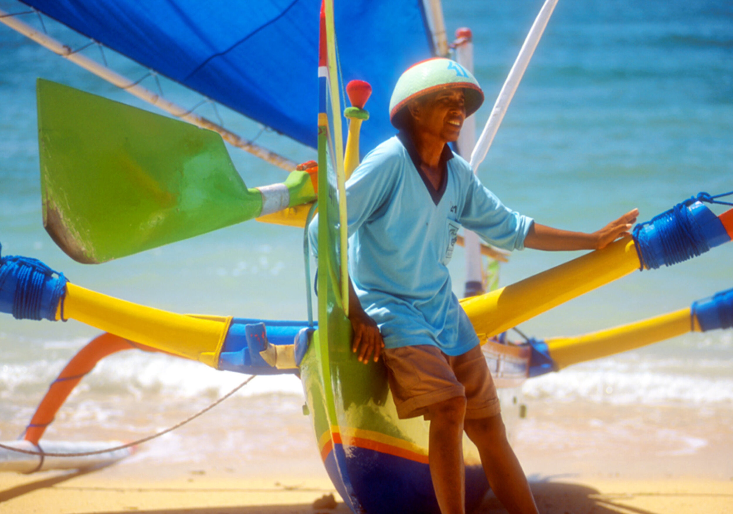
These are neighbours on the colour wheel, usually with a minor appearance of a complimentary colour thrown in It’s hard to get only adjacent colours, but if they are the dominant colour structure in the image, then that’s what you go by. Here in this Balinese outrigger image, we have cyan, blue, green and yellow all as adjacent colours. The complimentary skin and shorts only add to the composition. Neigbours on the colour wheel tend to blend well when used in a composition together.
Using a limited palette of adjacent colours can be enhanced by including white or black in the frame. Seeing with a critical eye will become second nature to you in practice, then it is never forgotten. It is up to you though, to decide what feels right.
Colour appreciation has no limits and its structure can be as individul as you want it to be.


Colour - Monochromatic
This refers to photographs made up of a single colour but with many shades or tones within it. They can create powerful compositions, and can offer a sense of visual cohesion to your viewer, as there are no conflicting colours. They are gradual tonal changes from light to dark of the same colour. They are quite restful to the eye as there is no colour contrast, only tonal. The raindrops on the leaf has a range of greens from light to dark, but with just a hint of yellow, but it is essentialy a green image.
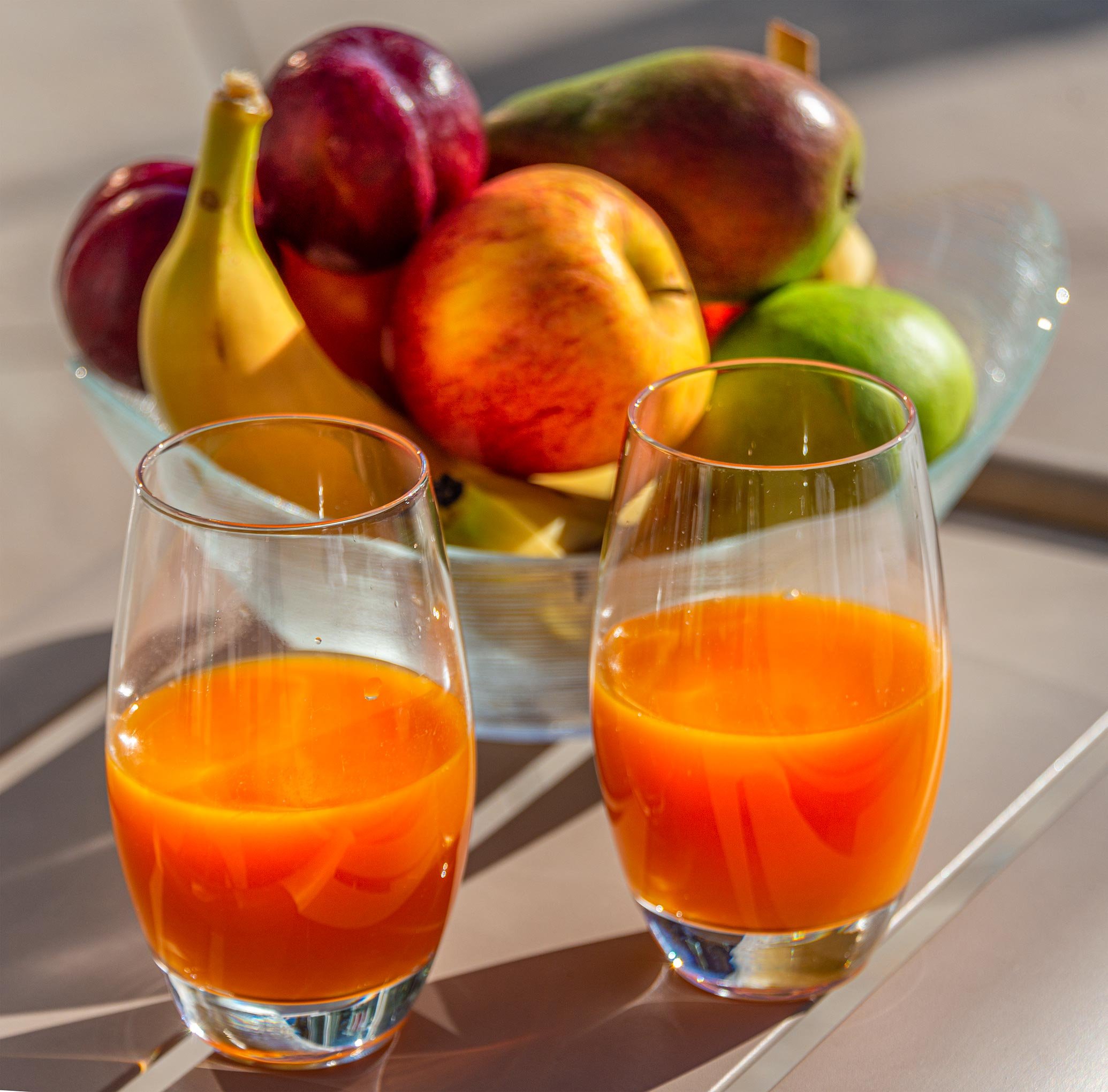
The same applies to the wading birds amid the odd metal stakes in this wetland lake, making this a predominantly orange image.


Spot colour
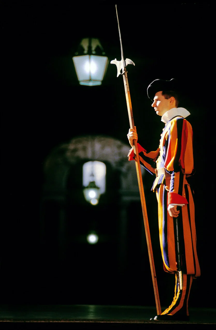
This effect acts like a torch highlighting your subject, and it can be very striking. But lighting does not have to use colour for it to be effective. The image of the KC135 aerial tanker is almost monochromatic yet the spotlight effect still draws you into the image. You can find this effect before or after a storm, or any situation where intense light illuminates an object where everything else has been excluded, either in shadow or where the path of the sun has been eclipsed.
Lake Manzie in Tanzania has the sun reflecting off the surface acting as a spotlight. Depending on your exposure, this could easily be a silhouette, but in this case it was not the requirement. Alternatively the image of the river Garonne in the French city of Toulouse has been slightly underexposed intentionally to give more of a silhouette effect. Both images have been lit by the sun bouncing off water giving a spotlight effect. The outcome of both was governed by the purpose for the image.